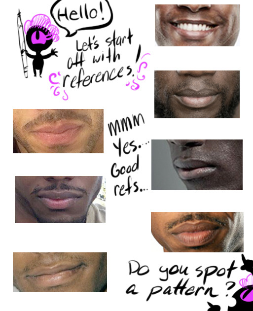
Hello! In celebration of a new year, I’m gonna show all of you a tip how to draw lips for Black/African/Dark Skinned people.
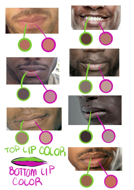
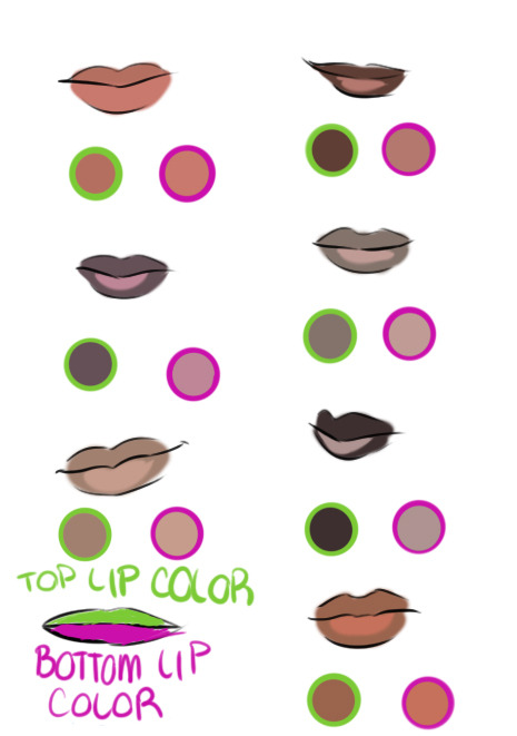
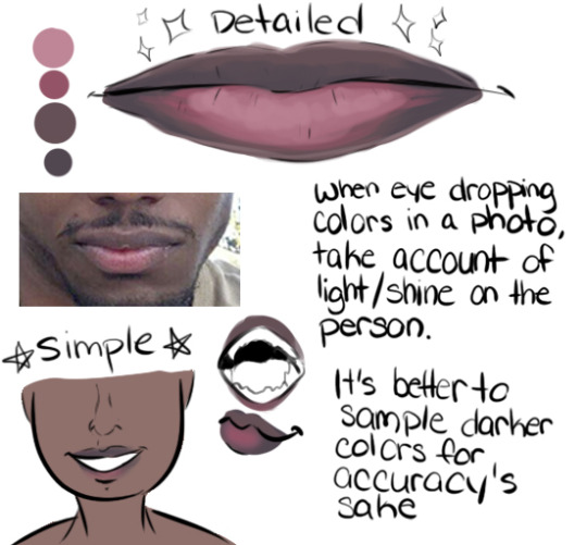
If you’re drawing a black/dark skinned person, the top lip is a slight step above or below their actual skin tone while the bottom lip can range from a faded pink to brown.
Black/African men’s and women’s lip lean towards “nude/palm of the hand” makeup color. Some cases it’s pink but everyone’s lip color varies from pink to brown. In my experience of going outside my house, the darker the person, the pinker the bottom lip is while the lighter brown skin lips will be closer to their actual skin tone.
Another note is that the pink /brown tone on the bottom of the lip is near the slit of the mouth, not the complete lip like lipstick makeup. Try adding different tones to a lip and blending both top and bottom lips together because everyone’s different! A very good detail to remember.
TL;DR: USE A REFERENCE. GOOGLE IMAGE SEARCH DOESN’T BITE! Thank you for your time! Go out and draw them awesome dark skinned characters and people!
Thanks for the patience, had to mull this one over. The more complex a design gets, the more difficult it is to break down. Basic character design tips may not be enough…so let’s delve into:
Character Design Tips Part 2!
Before we start, it’ll help to read my last character design post, where I laid out four concepts: shapes,silhouettes,colors, and inspiration. In this post, I aim to build on and rephrase these in a way that hopefully makes it easier to apply them. I’ll be drawing examples from my Power Rangers (2017) fanart to illustrate my points.
(Disclaimers:)
(Ideally, you should already be comfortable with drawing people. If not, look into figure drawing, gesture drawing, etc.)
(Whereas my previous tips were more tried and true, the tips here are more my own thoughts, so they may be half-formed.)
(Again, these are not rules. They’re just tips to add to your toolbox; the more tools you have, the more versatile you’ll become.)
Without further ado, let’s start!
Based off what we know about shapes, silhouettes, colors and inspiration, I want to cover: lines and angles, external and internal silhouettes, values, and references.
1. Shapes => Lines and Angles
Last time, I laid out three basic shapes:round, box, and triangle.
Problem: limiting yourself to these 3 shapes can be useful and fun for simpler designs, but they may be too simple or look out of place on more complex designs.
Solution: let’s go to the next level! Instead of shapes, shift your thinking to lines and angles!
Lines can be curved,straight, or diagonal. Angles can range from obtuse to acute angles. Follow your intuition: what feeling do you get from each line or angle? If I follow my own intuition, I see that:
curved lines = natural, soft
straight lines = balanced, grounded
diagonal lines = off-balance, in motion
obtuse angles = broad, relaxed
right angles = rigid, unnatural
acute angles = slim, dynamic
If this sounds familiar, you’re right! It’s just the shapes all over again:
curved lines make round shapes
straight lines with obtuse/right angles make boxy shapes
diagonal lines with acute angles make triangular shapes
But lo! Since we broke the shapes into their smaller components, it’s much more flexible! Now we can use lines and angles for more complex designs:
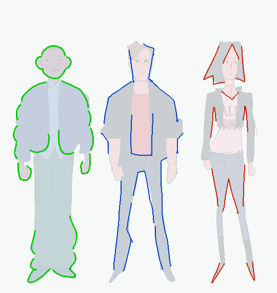
2. Silhouette => External and Internal Silhouettes
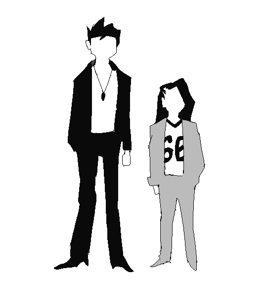
Last time, I explained the silhouette test: if you black out the figure, it should still be readable.
Problem: blacking out the figure only tests the outline of the design, i.e. the external silhouette. But what about the inside of the design?
Solution: block in the figure and test for the internal silhouette!
If you want not just an interesting outline, but an interesting costume, block in the major components of your design to see if it has a readable internal silhouette. This test can help you avoid boring or cluttered costumes and makes your design stand out. If your internal silhouette is too empty, try adding props or designs. If it’s too busy, simplify it.
3. Colors => Values
Last time, I talked about the 60-30-10 and 70-30 rules for color.
Problem: those rules work on the assumption that you’re only using 2 to 3 colors. But what if I want to use more colors?
Solution: good news! The same idea applies if you split your palette into 3 major values: shadows,midtones, and highlights.
Balance your palette by converting your colors to grayscale and applying the 60-30-10 rule to the values. This is related to the idea of silhouettes; if you get a nice internal silhouette, you’ll probably end up with a nicely balanced set of palette values, and vice versa.
“Good artists copy, great artists steal!” -Picasso
Problem: Coming up with something 100% original is tedious and doesn’t always give great results. It saps the inspiration right out of you!
Solution: It’s a lot easier to steal ideas from references!
Note: don’t just copy, steal! Cherry-pick/massage the aspects of the reference you find the most appealing and work them into your design. Ditch anything that you don’t care about. Make it your own! Make it something you can put your own name on! Below is the reference image I used for my designs:
And below is my fanart:
That’s it for now! Thanks for reading! If you guys want to see any other topics, feel free to ask and I can try my hand at it.
If you want to see my previous character design tips, click here. If you want to see the full-size Power Rangers fanart lineup, click here. If you want to see other character designs I’ve done, click here.
Don’t make their lips fucking huge as shit, then place them at the bottom of the face, near the chin area. Just fucking don’t you’re treading on very thing ice when you do that.
Black people’s lips in most cases are dark at the top, and light at the bottom (there’s a tutorial I can’t find that says the lighter shade is the same as the palm on our hands but I haven’t really noticed on my own body).
Do: Use a fuckign reference, google the shit, ask your local black tumblr artist good fucking golly gee willikers
Just a quick thing I put together. This blew my fucking MIND when my anatomy teacher pointed it out. My drawings instantly got better. You might know it (good for you, I wish I knew it before too T_T) or you might not and it might help you get better.
The wolves at Wolf Park Indiana were given paint as a form of enrichment and as a
fundraiser to make “original wolf art”. Most of the wolves were happy
to step in the paint for a piece of hot dog and make nice paw prints on a
page, but this guy decided rolling in it was way more fun.