This graffiti appeared overnight at 5 different job centres in Birmingham.
It’s referencing the increasingly harsh benefit sanctions in the UK which are punishing disabled people in particular.
Claimants who cannot work due to severe disabilities or chronic illnesses are being categorised as “fit to work” in order to meet targets and are not being given enough money to survive.
The majority of people who legally challenge their benefits sanctions or ‘fit to work’ decision have them overturned, but only after months without the money they need.
Estimates generally put the number of people who have died in the last few years directly due to benefit sanctions in the thousands. These include people who have died of starvation, exposure, because they couldn’t afford electricity to keep their insulin cold, or because they couldn’t afford treatment, among other things.
The DWP has even sent letters to people declaring them fit to work when in fact they have already died from their illness.
Fuck the DWP and job centres.
Good job, whoever painted these!
“A Birmingham City Council spokesman added: ‘Graffiti is illegal and can significantly increase people’s fears of crime and violence.”
steveholtvstheuniverse: Lmao like the only time I EVER see hard Disney fans even mention Ghibli and Miyazaki in comparison to Disney films is in light of Disney’s own mistakes and laziness like damn y’all need to calm down
Lemme teach you a lil’ somethin’ somethin’ about stylistic choices in animation and sheer laziness
STYLISTIC choices is about having the full capability of creating characters separate from the previous protagonists while at the same time tying them to the studio that produced them.
And that’s not even scratching the surface.
Considering that a good portion of Ghibli’s library consists of LEAD FEMALE PROTAGONISTS who are usually very young, they need to find a set balance between recognizable and unique.
Ghibli was founded on traditional art and the studio still holds many of those values with it. This is of course including hand-drawn animation in which there is no single model, only the same character drawn over and over again. Is this about CGI vs traditional? No, both can and have provided beautiful films and scenes but it’s not about which one deserves more recognition. It’s about the methods used and how the choices for each one vary. I only bring up the animation methods because it’s part of the reason as to WHY these characters are so simplistic in design.
Still though, they need each lead character to stick to the Ghibli/Miyazaki style to a certain extent. They need to share certain qualities to make them fall in line with the rest of Ghibli’s library.
I mean, they have their differences but they’re obviously Ghibli characters so okay they all have relatively small eyebrows (though considering that they are Japanese that ties in with their ethnicity but OKAY moving on), they all have the eye highlight thing going on, and they all have very non-pronounced noses. I suppose yeah those are all the same. They do shift but those characteristics are roughly the same.
Still though, that isn’t a problem nor is it blatant same-facing. All LAIKA characters have skewed noses, all Dreamworks characters have thin noses, and all Aardman characters have bulgy eyes. Does that mean they’re same-facing? No. It means they’re sticking to stylistic choices to keep themselves separate from the competition.
Don Bluth MADE the choice to stick to a style closely resembling Disney. You know what happened? A whole generation grew up thinking that Anastasia and Thumbelina were both DISNEY films, not Bluth and Fox animation.
There’s a reason why studios tend to go for their own set style.
But hey! Want even more evidence that it’s a stylistic choice?
Because THE VERY SAME CHOICES CAN BE SAID FOR THE DUDES
Save for Haku because he’s a fuckin’ dragon.
While gender is never really brought up in Ghibli films, masculinity and femininity are both neutral here, it’s safe to say that their designs and treatment are both equal. Ghibli isn’t out to make exclusively beautiful/handsome characters, they make them as simple as possible to keep them relatable and much more easier to manage.
The difference here is that Disney has always set out to make their MALES different while sticking their females to the same “doe eyed, small nose, thin lips” ideal. Yes, there is a set Disney style and it has always focused on those features and that necessarily isn’t a bad thing. It’s the Disney style. HOWEVER it seems to only apply to their females. Even worse is their marketing of said females.
GOTTA KEEP THEM GURLS PURTY
The Disney style has shifted from time to time and it shows evidence that it CAN include more diverse female designs. Both Kida and Calhoun are wonderful examples of this. It’s not as if Disney hasn’t evolved or changed their views on female characters to a certain extent. Unfortunately, said shifts haven’t always worked out in our favor or headed in the right direction. It wasn’t until Tangled that Disney came out with it’s true “get richer quicker” scheme with their female leads.
watch as i shift into MAXIMUM PUNZEL-DRIVE
As of late it’s Disney’s sheer laziness when it comes to female design and their own avarice that has caused SUUUUCH a dramatic shift in how fans are taking the Disney style now. When Ghibli audiences and fans never look at a new movie and go “oh it’s Chihiro but tiny” or “oh it’s Chihiro but on a broom.” That is the set style, not a lazy copy-paste.
But hey, let’s bring in OTHER females to see how this works out. I mean, the Ghibli style is prevalent to ALL of their characters so surely they all the parents look exactly like their children.
Let’s look at these lovely lady leads and compare them to their parents.
Congrats, kids, you’re all adopted!
WEIRDLY ENOUGH all of the characters and their parents (if they have any) share same characteristics while at the same time remaining completely unique to each other. It’s almost as if they also take after their father and/or previous generations of their familly. Haha, genetics!
But okay, let’s be a little more fair with Disney.
Let’s look at two families with two daughters.
Mitosis or go home
There is having stylistic choices and there is being lazy.
There is creating a character with similarities to their parent and there is making a recolor of your lead character.
There is creating simple designs for a traditionally animated film and there is reusing the same model because it worked so well the first time.
There is being a small Tokyo-based studio with 300 employees and there is being a large American animation studio with 800+ employees.
THAT is why no one ever complains about Ghibli’s approach to character design and THAT is why Disney doesn’t even come close to Miyazaki.
Let’s finish this off with some MORE wonderful Ghibli characters (most of which being my personal favorites so they belong on here too.)
Now go watch more Ghibli.
And also Studio Ponoc! (They’re made of Ghibli animators who wanted to continue making full-length films.) They released their first movie Mary and the Witch’s Flower last summer. They’re still finding their style but clearly show a deep love of storytelling and animation.
The problem isn’t that “the country is divided” the problem is the increasing acceptance of fascism as a legitimate political position. Framing it as a problem of division puts those who want to kill the poor, LGBT people, and poc on equal moral footing with those who would like not to die.
At Target this lady told her son he couldn’t have a Wonder Woman doll because “that’s for girls” and then bought her daughter the same one. It got me thinking about how often I see people bar young boys from appreciating girls/women as protagonists and heroes, and my own experience with it as a kid.
When a character doesn’t realize they’ve been, like, shot or whatever and they hand brushes against their side and comes away wet with blood, and they’re just staring at it like wtf is this and then their knees just totally give out on them and they sink down, maybe gasping a little as the reality finally hits them. That’s good stuff.
I see that, and raise you a character who knows they’ve been shot, but waits until the rest of their crew is out of sight to put their hand against the slowly spreading stain of blood on their shirt, then trying to steady their breathing so they can follow without letting on how injured they are.
Okay but like the character who doesn’t realize they’ve been hurt trying to see if everyone else is okay only to slowly realize that everyone is looking at them with mounting horror. Then they touch their side to find it’s wet and oh no
all 3 of you are evil but i admire, respect, and fear you
The thing about how women in comics used to be drawn and sometimes are still drawn, you can only really understand the difference between an action girl being forced into unrealistic sexual, sensual positions, and an actual strong and well posed, empowering but still sexy female character, when you see what it looks like to have male characters depicted in overtly sensual poses
And I’m not talking about the Hawkeye Initiative or any given parody
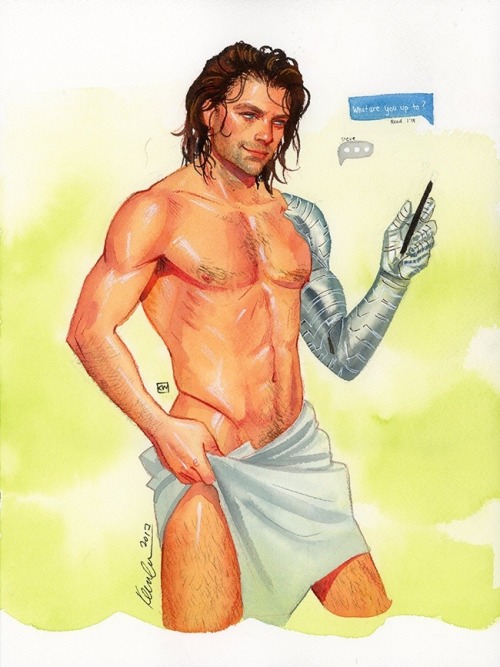
I actually want to draw a comparison using art by Kevin Wada
Kevin Wada is a proud part of the LGBTQ+ community and he has this unique ability to sexualize mainstream male heroes without it looking like a parody. He draws covers for multiple big comic companies and his style reminiscent of old fashion magazines, drawn largely in traditional watercolor, has made him a stalwart of the industry.
He also draws a lot of naked Bucky Barnes.
Anyway, I want to talk about how interesting his art is, the difference between his power poses and his sexy poses for male and female characters.
A typical power pose for a male comics character would look like this
Whereas every so often with female heroes you get something like this
Not all the time, of course, but it happens and it happens in the wrong places. You wouldn’t be posing like a cover model in the middle of a battle, you really wouldn’t.
But when it comes to Wada and male and female characters, the difference is pretty clear.
When he draws male characters, they more often look like this
Sensual, in a pose you wouldn’t usually see a big, muscular hero doing. If not that, then playful, sexy, for looking at, but nothing about their anatomy overly exaggerated
How he draws women is also very clearly different from many other artists, from sexy pose to power pose.
Still posing for the camera, still to be looked at, but very, very different from how we’ve seen female characters portrayed in mainstream comics in the past.
And I guess it’s really just a matter of variety? Objectification in art is a long time debate and appears everywhere always, but for all that we can argue about its impact on popular media, there are a few things I know for sure:
1) having a female character pose like a playboy cover girl in the middle of a battle scene is just Bad Art and y’all need to find better references
2) female power poses will never look quite as right as when they’re drawn by people who know the value of expressing personality through pose (it’s basic animation principles and some artists still need to learn it) and who actually know what a female character’s personality beyond “sexy”
3) Iron Man or Batman posing like they’re about to beat somebody up is 100% not the same as a fashion drawing by Kevin Wada where a Typical Beefy Action Guy gets to pose like a flirty pretty boy
4) the MCU films have figured out the value of pandering to female audiences by sexually objectifying all their male action heroes while simultaneously appealing to the male demographic’s action movie power fantasy. Quoting Chris Hemsworth and Taika Waititi: “I’m not a piece of meat” “Uh, yes you are.”
They definitely struck some kind of balance there.
Also, more important than this entire post: y’all should follow @kevinwada on Tumblr and give him love because his art is divine and his talent beyond words
Hey all! Trying to make a bunch of D&D stuff for my summer cons–something I’m calling the Summer of D&D [so creative eh?]–and I’m starting it off with some class related buttons, so here’s pt.1 of the collection!